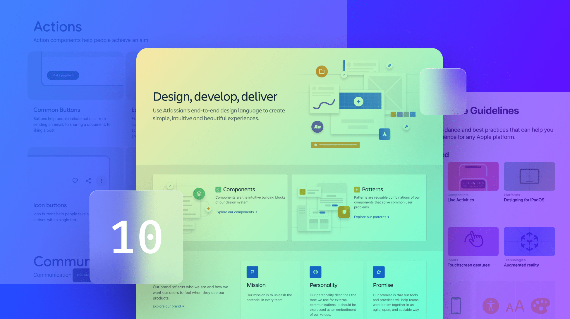
Ten Design System Examples in 2024 to Inspire Your Future Design System
Explore the best design system examples from leading brands like Salesforce and Apple. Discover how these systems ensure consistency, efficiency, and scalability in design.

Explore the best design system examples from leading brands like Salesforce and Apple. Discover how these systems ensure consistency, efficiency, and scalability in design.
Whether you're creating your own design system or looking for inspiration, these ten design system examples are the industry's best.
Have you ever lamented the endless back and forth between design teams, product teams, marketing, and development while working to solve a problem or implement a new feature? The real question is, who hasn’t?
Enter: design systems. In its most basic form, a design system is a massive library and single source of truth for all the reusable building blocks a team uses to create a user experience. While the word ‘design’ is in the term itself, a design system isn’t just for the design team. It’s for product pros, developers, marketers—anyone whose work touches the product. It exists to help companies create a cohesive, unified, aligned experience within their product by empowering all team members with the same resources, standards, and rules of engagement.
For a detailed explanation, check out our article on What Is a Design System?.
Salesforce's Lightning Design System focuses on empowering individual creators with tools specific to their trade, allowing developers to concentrate on application logic while designers focus on user experience, interactions, and flows. The clean, easy-to-navigate layout enhances its usability.
Hewlett Packard’s Grommet is a reach-based framework providing accessibility, modularity, responsiveness, and theming for app development. Its attention to accessibility and responsiveness is particularly noteworthy.
The BBC developed GEL (Global Experience Language) to ensure uniformity and consistency across its vast array of digital experiences. GEL supports the integration of billions of components and UI elements.
Apple’s Human Interface Guidelines provide a vast library for designing and building apps that seamlessly integrate into Apple’s interface, emphasizing user-friendly design principles.
IBM’s Design Language offers an incredibly comprehensive design system with beautifully crafted language and a layout that makes exploring the system a pleasure. It covers typography, layout, and data visualizations.
Google’s Material Design is an adaptable system of guidelines, components, and tools backed by open-source code. It supports best practices in user interface design and streamlines collaboration between designers and developers.
Indiana University’s Rivet helps the university's team work together more effectively, creating a seamless, consistent user experience. Rivet includes well-made tutorials and allows users to explore past versions to understand its evolution.
“Wtf is Solid” is the opening line on Buzzfeed’s design system site. Solid uses immutable, atomic CSS classes for rapid prototyping and feature development, providing consistent styling options and flexibility.
The U.S. Web Design System features an active open-source community of engineers, content creators, designers, and contributors. It supports numerous U.S. government agencies and nearly 200 sites.
Atlassian’s Design System includes kits, guides, templates, and comprehensive information about the brand’s voice, tone, content guidelines, and writing style.
There’s no one-size-fits-all for a design system, so hopefully, the examples above (and how different they all are, both in structure and content) will help you on your path to developing your own unique system. Happy creating!