Automate design-to-code with Supernova

Automate your design systems workflow, eliminate busywork of manual updates, and ship your brand faster than ever.

Try for free

Helping companies document their design systems

From Figma variables to Tailwind CSS in a few clicks

Stop waiting weeks for Figma variable updates to reach code. With Supernova’s pipeline automations, your team can quickly implement design token and asset changes without disrupting development—keeping your workflow smooth and efficient.

Radius Small
Radius Medium
Radius Large
Radius Full
[
  {
    “name”: “Radius Small”,
    “value”: “8px”,
  }
  {
    “name”: “Radius Medium”,
    “value”: “16px”,
  }
  {
    “name”: “Radius Large”,
    “value”: “24px”,
  }
  {
    “name”: “Radius Full”,
    “value”: “50%”,
  }
]
:root {
  --borderRadiusSmall: 8px;
  --borderRadiusMedium: 16px;
  --borderRadiusLarge: 24px;
  --borderRadiusFull: 50%;
}
const borderRadiusRadiusSmall = {
  measure: 8,
  unit: "Pixels",
  css: "8px",
};
const borderRadiusRadiusMedium = {
  measure: 16,
  unit: "Pixels",
  css: "8px",
};
const borderRadiusRadiusLarge = {
  measure: 24,
  unit: "Pixels",
  css: "8px",
};
const borderRadiusRadiusFull = {
  measure: 50,
  unit: "Percent",
  css: "50%",
};

export const Measures = {
  borderRadiusRadiusSmall,
  borderRadiusRadiusMedium,
  borderRadiusRadiusLarge,
  borderRadiusRadiusFull,
}
import SwiftUI
public struct AppMeasures {
  public static let borderRadiusRadiusSmall = 8
  public static let borderRadiusRadiusMedium = 16
  public static let borderRadiusRadiusLarge = 24
  public static let borderRadiusRadiusFull = 50
}
<resources>
  <dimen name="border_radius_radius_small">8dp</dimen>
  <dimen name="border_radius_radius_medium">16dp</dimen>
  <dimen name="border_radius_radius_large">24dp</dimen>
  <dimen name="border_radius_radius_full">50dp</dimen>
</resources>
Export to any
framework you need

Supercharge your workflow with Supernova SDK, CLI and VS code extension

Leverage the power of Supernova’s SDK, CLI, and VS Code Extension to access, customize, and automate your design system data effortlessly—ensuring full control and seamless integration into your development workflow.

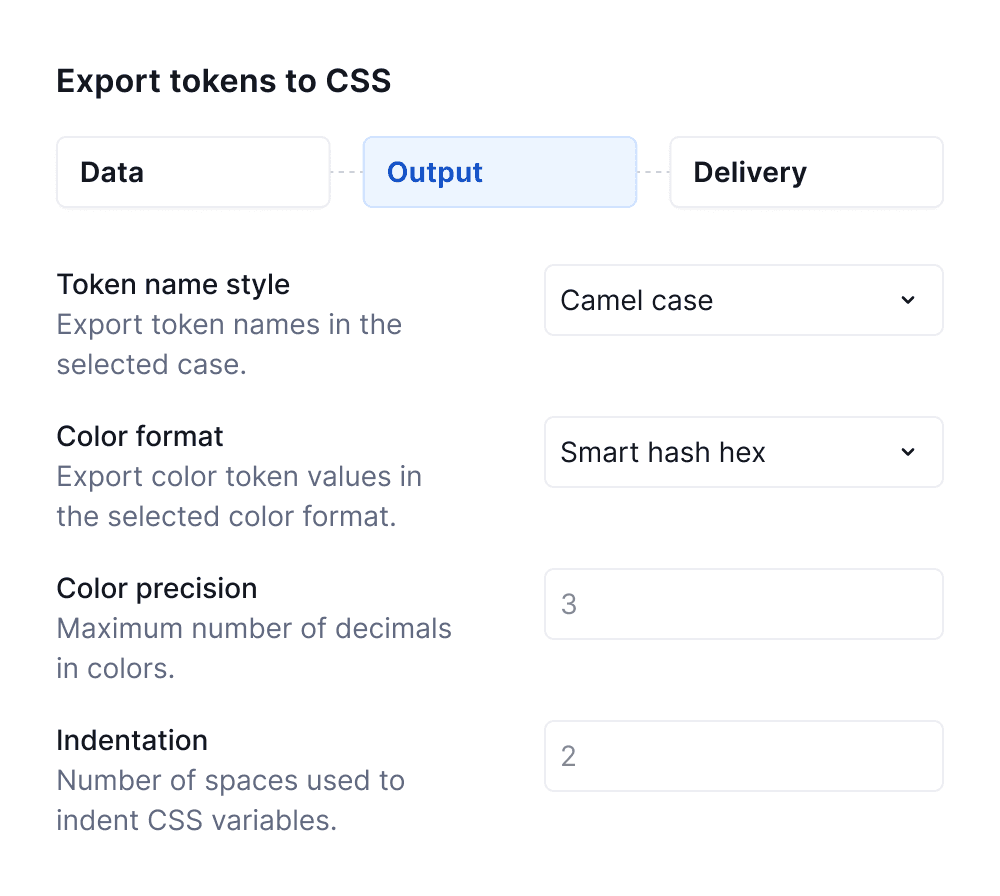
Flexible exports, built for your tech stack

Easily configure and adapt token and asset formats to match your development needs—no coding required. With Supernova’s intuitive setup and no-code customization, exporting design data to your preferred tech stack has never been easier.

Camel case
1 2 3 4 5 6 7 8 9 10 11 12 13 14 15 16 17 18 19 20 21 22 23 24 25 26 27 28 29 30 31 32 33 34 35 36 37 38 39 40 41 42 43 44 45 46 47 48 49 50 51 52 53 54 55 56 57 58 59 60 61 62 63 64
:root { /* For text and icons. */ --colorForegroundNeutral: #141717
; /* For text and icons. */ --colorForegroundNeutralFaded: #606981
; --colorForegroundPrimary: #104fc6
; --colorForegroundCritical: #cb101d
; --colorForegroundPositive: #05751f
; --colorForegroundUpgrade: #874ce6
; /* You might not need this - just apply Opacity Disabled (40%) token to a layer. */ --colorForegroundDisabled: #c7cdd0
; --colorForegroundPlaceholder: #7f8604
; /* Use together with Overlay elevation. It will then ensure it works also in dark mode properly. */ --colorBackgroundElevationOverlay: #ffffff
; --colorBackgroundNeutral: #182d60a
; --colorBackgroundNeutralHighlighted: #182d6614
; --colorBackgroundNeutralFaded: #141a2b05
; --colorBackgroundPrimary: #104fc6
; /* For hover and active states */ --colorBackgroundPrimaryHighlighted: #004ee1
; --colorBackgroundPrimaryFaded: #c4f5ff
; --colorBackgroundCritical: #e22c25
; --colorBackgroundCriticalHighlighted: #cb101d
; --colorBackgroundCriticalFaded: #fef1f2
; --colorBackgroundPositive: #11b850
; --colorBackgroundPositiveHighlighted: #05751f
; --colorBackgroundPositiveFaded: #ebfef6
; --colorBackgroundUpgrade: #874ce6
; --colorBackgroundUpgradeHighlighted: #6a2bbf
; --colorBackgroundUpgradeFaded: #f5f2fd
; /* You might not need this - just apply Opacity Disabled (40%) token to a layer. */ --colorBackgroundDisabled: #182d660a
; /* You might not need this - just apply Opacity Disabled (40%) token to a layer. */ --colorBackgroundDisabledFaded: #141a2b05
; /* Use only for body background. If you need a background for your components, use one of the Background / Elevation styles. */ --colorBackgroundPage: #ffffff
; /* Use only for background of the main page sections. If you need a background for your components, use one of the Background / Elevation styles. */ --colorBackgroundPageFaded: #fafafa
; /* Used for highlighted text in inputs. */ --colorBackgroundFocusTextHighlight: #d0e2ff
; --colorBorderNeutralFaded: #ececef3
; --colorBorderPrimary: #191a24
; --colorBorderCritical: #cb101d
; --colorBorderCriticalFaded: #fbd5d8
; --colorBorderPositive: #05751f
; --colorBorderPositiveFaded: #cbdcd5
; --colorBorderUpgrade: #6a2bbf
; --colorBorderUpgradeFaded: #e23d0fa
; /* Not overriden by a theme. */ --colorPersistentWhite: #ffffff
; --colorColorSubBlack: #040a1e
; --colorColorSubBlue: #6f67e
; --colorColorTeal: #00ffc2
; }
1 2 3 4 5 6 7 8 9 10 11 12 13 14 15 16 17 18 19 20 21 22 23 24 25 26 27 28 29 30 31 32 33 34 35 36 37 38 39 40 41 42 43 44 45 46 47 48 49 50 51 52 53 54 55 56 57 58 59 60 61 62 63 64
:root { /* For text and icons. */ --color-foreground-neutral: #141717
; /* For text and icons. */ --color-foreground-neutral-faded: #606981
; --color-foreground-primary: #104fc6
; --color-foreground-critical: #cb101d
; --color-foreground-positive: #05751f
; --color-foreground-upgrade: #874ce6
; /* You might not need this - just apply Opacity Disabled (40%) token to a layer. */ --color-foreground-disabled: #c7cdd0
; --color-foreground-placeholder: #7f8604
; /* Use together with Overlay elevation. It will then ensure it works also in dark mode properly. */ --color-background-elevation-overlay: #ffffff
; --color-background-neutral: #182d60a
; --color-background-neutral-highlighted: #182d6614
; --color-background-neutral-faded: #141a2b05
; --color-background-primary: #104fc6
; /* For hover and active states */ --color-background-primary-highlighted: #004ee1
; --color-background-primary-faded: #c4f5ff
; --color-background-critical: #e22c25
; --color-background-critical-highlighted: #cb101d
; --color-background-critical-faded: #fef1f2
; --color-background-positive: #11b850
; --color-background-positive-highlighted: #05751f
; --color-background-positive-faded: #ebfef6
; --color-background-upgrade: #874ce6
; --color-background-upgrade-highlighted: #6a2bbf
; --color-background-upgrade-faded: #f5f2fd
; /* You might not need this - just apply Opacity Disabled (40%) token to a layer. */ --color-background-disabled: #182d660a
; /* You might not need this - just apply Opacity Disabled (40%) token to a layer. */ --color-background-disabled-faded: #141a2b05
; /* Use only for body background. If you need a background for your components, use one of the Background / Elevation styles. */ --color-background-page: #ffffff
; /* Use only for background of the main page sections. If you need a background for your components, use one of the Background / Elevation styles. */ --color-background-page-faded: #fafafa
; /* Used for highlighted text in inputs. */ --color-background-focus-text-highlight: #d0e2ff
; --color-border-neutral-faded: #ececef3
; --color-border-primary: #191a24
; --color-border-critical: #cb101d
; --color-border-critical-faded: #fbd5d8
; --color-border-positive: #05751f
; --color-border-positive-faded: #cbdcd5
; --color-border-upgrade: #6a2bbf
; --color-border-upgrade-faded: #e23d0fa
; /* Not overriden by a theme. */ --color-persistent-white: #ffffff
; --color-color-sub-black: #040a1e
; --color-color-sub-blue: #6f67e
; --color-color-teal: #00ffc2
; }
1 2 3 4 5 6 7 8 9 10 11 12 13 14 15 16 17 18 19 20 21 22 23 24 25 26 27 28 29 30 31 32 33 34 35 36 37 38 39 40 41 42 43 44 45 46 47 48 49 50 51 52 53 54 55 56 57 58 59 60 61 62 63 64
:root { /* For text and icons. */ --color_foreground_neutral: #141717
; /* For text and icons. */ --color_foreground_neutral_faded: #606981
; --color_foreground_primary: #104fc6
; --color_foreground_critical: #cb101d
; --color_foreground_positive: #05751f
; --color_foreground_upgrade: #874ce6
; /* You might not need this - just apply Opacity Disabled (40%) token to a layer. */ --color_foreground_disabled: #c7cdd0
; --color_foreground_placeholder: #7f8604
; /* Use together with Overlay elevation. It will then ensure it works also in dark mode properly. */ --color_background_elevation_overlay: #ffffff
; --color_background_neutral: #182d60a
; --color_background_neutral_highlighted: #182d6614
; --color_background_neutral_faded: #141a2b05
; --color_background_primary: #104fc6
; /* For hover and active states */ --color_background_primary_highlighted: #004ee1
; --color_background_primary_faded: #c4f5ff
; --color_background_critical: #e22c25
; --color_background_critical_highlighted: #cb101d
; --color_background_critical_faded: #fef1f2
; --color_background_positive: #11b850
; --color_background_positive_highlighted: #05751f
; --color_background_positive_faded: #ebfef6
; --color_background_upgrade: #874ce6
; --color_background_upgrade_highlighted: #6a2bbf
; --color_background_upgrade_faded: #f5f2fd
; /* You might not need this - just apply Opacity Disabled (40%) token to a layer. */ --color_background_disabled: #182d660a
; /* You might not need this - just apply Opacity Disabled (40%) token to a layer. */ --color_background_disabled_faded: #141a2b05
; /* Use only for body background. If you need a background for your components, use one of the Background / Elevation styles. */ --color_background_page: #ffffff
; /* Use only for background of the main page sections. If you need a background for your components, use one of the Background / Elevation styles. */ --color_background_page_faded: #fafafa
; /* Used for highlighted text in inputs. */ --color_background_focus_text_highlight: #d0e2ff
; --color_border_neutral_faded: #ececef3
; --color_border_primary: #191a24
; --color_border_critical: #cb101d
; --color_border_critical_faded: #fbd5d8
; --color_border_positive: #05751f
; --color_border_positive_faded: #cbdcd5
; --color_border_upgrade: #6a2bbf
; --color_border_upgrade_faded: #e23d0fa
; /* Not overriden by a theme. */ --color_persistent_white: #ffffff
; --color_color_sub_black: #040a1e
; --color_color_sub_blue: #6f67e
; --color_color_teal: #00ffc2
; }
1 2 3 4 5 6 7 8 9 10 11 12 13 14 15 16 17 18 19 20 21 22 23 24 25 26 27 28 29 30 31 32 33 34 35 36 37 38 39 40 41 42 43 44 45 46 47 48 49 50 51 52 53 54 55 56 57 58 59 60 61 62 63 64
:root { /* For text and icons. */ --ColorForegroundNeutral: #141717
; /* For text and icons. */ --ColorForegroundNeutralFaded: #606981
; --ColorForegroundPrimary: #104fc6
; --ColorForegroundCritical: #cb101d
; --ColorForegroundPositive: #05751f
; --ColorForegroundUpgrade: #874ce6
; /* You might not need this - just apply Opacity Disabled (40%) token to a layer. */ --ColorForegroundDisabled: #c7cdd0
; --ColorForegroundPlaceholder: #7f8604
; /* Use together with Overlay elevation. It will then ensure it works also in dark mode properly. */ --ColorBackgroundElevationOverlay: #ffffff
; --ColorBackgroundNeutral: #182d60a
; --ColorBackgroundNeutralHighlighted: #182d6614
; --ColorBackgroundNeutralFaded: #141a2b05
; --ColorBackgroundPrimary: #104fc6
; /* For hover and active states */ --ColorBackgroundPrimaryHighlighted: #004ee1
; --ColorBackgroundPrimaryFaded: #c4f5ff
; --ColorBackgroundCritical: #e22c25
; --ColorBackgroundCriticalHighlighted: #cb101d
; --ColorBackgroundCriticalFaded: #fef1f2
; --ColorBackgroundPositive: #11b850
; --ColorBackgroundPositiveHighlighted: #05751f
; --ColorBackgroundPositiveFaded: #ebfef6
; --ColorBackgroundUpgrade: #874ce6
; --ColorBackgroundUpgradeHighlighted: #6a2bbf
; --ColorBackgroundUpgradeFaded: #f5f2fd
; /* You might not need this - just apply Opacity Disabled (40%) token to a layer. */ --ColorBackgroundDisabled: #182d660a
; /* You might not need this - just apply Opacity Disabled (40%) token to a layer. */ --ColorBackgroundDisabledFaded: #141a2b05
; /* Use only for body background. If you need a background for your components, use one of the Background / Elevation styles. */ --ColorBackgroundPage: #ffffff
; /* Use only for background of the main page sections. If you need a background for your components, use one of the Background / Elevation styles. */ --ColorBackgroundPageFaded: #fafafa
; /* Used for highlighted text in inputs. */ --ColorBackgroundFocusTextHighlight: #d0e2ff
; --ColorBorderNeutralFaded: #ececef3
; --ColorBorderPrimary: #191a24
; --ColorBorderCritical: #cb101d
; --ColorBorderCriticalFaded: #fbd5d8
; --ColorBorderPositive: #05751f
; --ColorBorderPositiveFaded: #cbdcd5
; --ColorBorderUpgrade: #6a2bbf
; --ColorBorderUpgradeFaded: #e23d0fa
; /* Not overriden by a theme. */ --ColorPersistentWhite: #ffffff
; --ColorColorSubBlack: #040a1e
; --ColorColorSubBlue: #6f67e
; --ColorColorTeal: #00ffc2
; }
1 2 3 4 5 6 7 8 9 10 11 12 13 14 15 16 17 18 19 20 21 22 23 24 25 26 27 28 29 30 31 32 33 34 35 36 37 38 39 40 41 42 43 44 45 46 47 48 49 50 51 52 53 54 55 56 57 58 59 60 61 62 63 64
:root { /* For text and icons. */ --Color-Foreground-Neutral: #141717
; /* For text and icons. */ --Color-Foreground-Neutral-Faded: #606981
; --Color-Foreground-Primary: #104fc6
; --Color-Foreground-Critical: #cb101d
; --Color-Foreground-Positive: #05751f
; --Color-Foreground-Upgrade: #874ce6
; /* You might not need this - just apply Opacity Disabled (40%) token to a layer. */ --Color-Foreground-Disabled: #c7cdd0
; --Color-Foreground-Placeholder: #7f8604
; /* Use together with Overlay elevation. It will then ensure it works also in dark mode properly. */ --Color-Background-Elevation-Overlay: #ffffff
; --Color-Background-Neutral: #182d60a
; --Color-Background-Neutral-Highlighted: #182d6614
; --Color-Background-Neutral-Faded: #141a2b05
; --Color-Background-Primary: #104fc6
; /* For hover and active states */ --Color-Background-Primary-Highlighted: #004ee1
; --Color-Background-Primary-Faded: #c4f5ff
; --Color-Background-Critical: #e22c25
; --Color-Background-Critical-Highlighted: #cb101d
; --Color-Background-Critical-Faded: #fef1f2
; --Color-Background-Positive: #11b850
; --Color-Background-Positive-Highlighted: #05751f
; --Color-Background-Positive-Faded: #ebfef6
; --Color-Background-Upgrade: #874ce6
; --Color-Background-Upgrade-Highlighted: #6a2bbf
; --Color-Background-Upgrade-Faded: #f5f2fd
; /* You might not need this - just apply Opacity Disabled (40%) token to a layer. */ --Color-Background-Disabled: #182d660a
; /* You might not need this - just apply Opacity Disabled (40%) token to a layer. */ --Color-Background-Disabled-Faded: #141a2b05
; /* Use only for body background. If you need a background for your components, use one of the Background / Elevation styles. */ --Color-Background-Page: #ffffff
; /* Use only for background of the main page sections. If you need a background for your components, use one of the Background / Elevation styles. */ --Color-Background-Page-Faded: #fafafa
; /* Used for highlighted text in inputs. */ --Color-Background-Focus-Text-Highlight: #d0e2ff
; --Color-Border-Neutral-Faded: #ececef3
; --Color-Border-Primary: #191a24
; --Color-Border-Critical: #cb101d
; --Color-Border-Critical-Faded: #fbd5d8
; --Color-Border-Positive: #05751f
; --Color-Border-Positive-Faded: #cbdcd5
; --Color-Border-Upgrade: #6a2bbf
; --Color-Border-Upgrade-Faded: #e23d0fa
; /* Not overriden by a theme. */ --Color-Persistent-White: #ffffff
; --Color-Color-Sub-Black: #040a1e
; --Color-Color-Sub-Blue: #6f67e
; --Color-Color-Teal: #00ffc2
; }
1 2 3 4 5 6 7 8 9 10 11 12 13 14 15 16 17 18 19 20 21 22 23 24 25 26 27 28 29 30 31 32 33 34 35 36 37 38 39 40 41 42 43 44 45 46 47 48 49 50 51 52 53 54 55 56 57 58 59 60 61 62 63 64
:root { /* For text and icons. */ --COLOR_FOREGROUND_NEUTRAL: #141717
; /* For text and icons. */ --COLOR_FOREGROUND_NEUTRAL_FADED: #606981
; --COLOR_FOREGROUND_PRIMARY: #104fc6
; --COLOR_FOREGROUND_CRITICAL: #cb101d
; --COLOR_FOREGROUND_POSITIVE: #05751f
; --COLOR_FOREGROUND_UPGRADE: #874ce6
; /* You might not need this - just apply Opacity Disabled (40%) token to a layer. */ --COLOR_FOREGROUND_DISABLED: #c7cdd0
; --COLOR_FOREGROUND_PLACEHOLDER: #7f8604
; /* Use together with Overlay elevation. It will then ensure it works also in dark mode properly. */ --COLOR_BACKGROUND_ELEVATION_OVERLAY: #ffffff
; --COLOR_BACKGROUND_NEUTRAL: #182d60a
; --COLOR_BACKGROUND_NEUTRAL_HIGHLIGHTED: #182d6614
; --COLOR_BACKGROUND_NEUTRAL_FADED: #141a2b05
; --COLOR_BACKGROUND_PRIMARY: #104fc6
; /* For hover and active states */ --COLOR_BACKGROUND_PRIMARY_HIGHLIGHTED: #004ee1
; --COLOR_BACKGROUND_PRIMARY_FADED: #c4f5ff
; --COLOR_BACKGROUND_CRITICAL: #e22c25
; --COLOR_BACKGROUND_CRITICAL_HIGHLIGHTED: #cb101d
; --COLOR_BACKGROUND_CRITICAL_FADED: #fef1f2
; --COLOR_BACKGROUND_POSITIVE: #11b850
; --COLOR_BACKGROUND_POSITIVE_HIGHLIGHTED: #05751f
; --COLOR_BACKGROUND_POSITIVE_FADED: #ebfef6
; --COLOR_BACKGROUND_UPGRADE: #874ce6
; --COLOR_BACKGROUND_UPGRADE_HIGHLIGHTED: #6a2bbf
; --COLOR_BACKGROUND_UPGRADE_FADED: #f5f2fd
; /* You might not need this - just apply Opacity Disabled (40%) token to a layer. */ --COLOR_BACKGROUND_DISABLED: #182d660a
; /* You might not need this - just apply Opacity Disabled (40%) token to a layer. */ --COLOR_BACKGROUND_DISABLED_FADED: #141a2b05
; /* Use only for body background. If you need a background for your components, use one of the Background / Elevation styles. */ --COLOR_BACKGROUND_PAGE: #ffffff
; /* Use only for background of the main page sections. If you need a background for your components, use one of the Background / Elevation styles. */ --COLOR_BACKGROUND_PAGE_FADED: #fafafa
; /* Used for highlighted text in inputs. */ --COLOR_BACKGROUND_FOCUS_TEXT_HIGHLIGHT: #d0e2ff
; --COLOR_BORDER_NEUTRAL_FADED: #ececef3
; --COLOR_BORDER_PRIMARY: #191a24
; --COLOR_BORDER_CRITICAL: #cb101d
; --COLOR_BORDER_CRITICAL_FADED: #fbd5d8
; --COLOR_BORDER_POSITIVE: #05751f
; --COLOR_BORDER_POSITIVE_FADED: #cbdcd5
; --COLOR_BORDER_UPGRADE: #6a2bbf
; --COLOR_BORDER_UPGRADE_FADED: #e23d0fa
; /* Not overriden by a theme. */ --COLOR_PERSISTENT_WHITE: #ffffff
; --COLOR_COLOR_SUB_BLACK: #040a1e
; --COLOR_COLOR_SUB_BLUE: #6f67e
; --COLOR_COLOR_TEAL: #00ffc2
; }

Connect with your development tools of choice

Connect Supernova effortlessly with your existing development ecosystem—whether it’s GitHub, Azure DevOps, GitLab, BitBucket, or custom REST endpoints—ensuring a smooth and automated workflow.

Get more out of Supernova

Developer Documentation

Get all the details on the Supernova developer features in our in-depth documentation site.

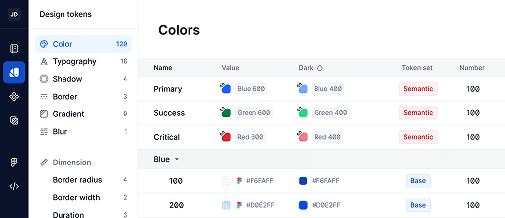
Design System Management

Manage your design tokens and components in one place. Supernova automatically syncs with your data sources.

Design-to-Code Efficiency Checklist

Optimize your design-to-code workflow with this practical checklist.

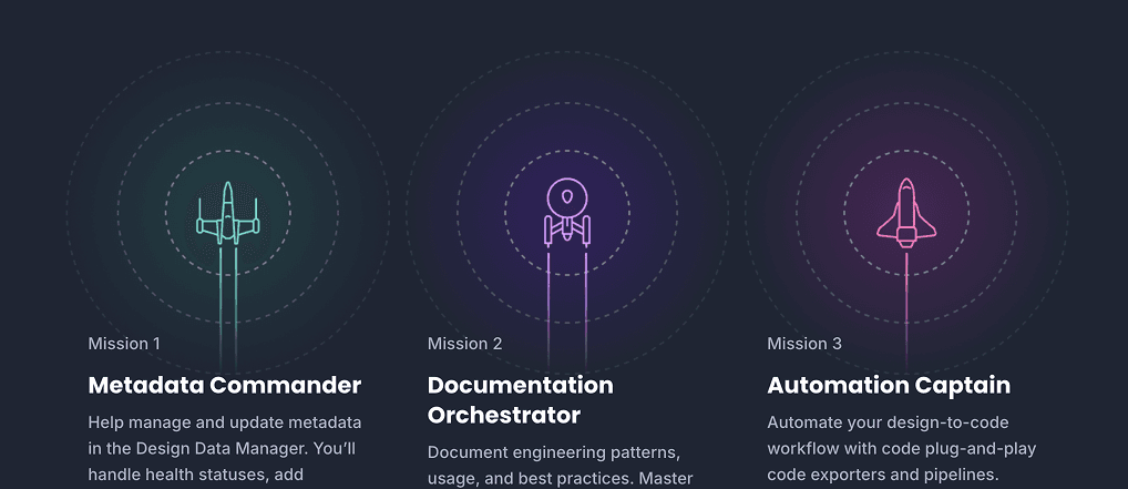
Developer's Playbook

Guide for developers to mastering, customizing, and automating within Supernova's ecosystem.

Ready to rethink your product discovery proces?

Join the Portal waitlist