Exploring the Fundamentals of Design System Components
- Authors

- Name and Role
- Nezar MansourContent Writer
Welcome to the beginning of our blog series on design system components! Components are the essential building blocks of design systems, which are crucial in creating consistent and efficient user interfaces. In this post, we'll explore what design system components are and delve into the eight fundamentals that will help you create a robust and effective design system.
What is a design system component?
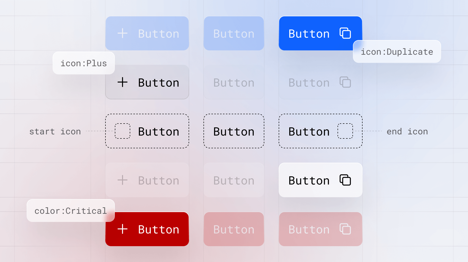
A design system component is a modular, reusable element used in a design system to create consistent user interfaces. Components can include various elements such as buttons, form fields, and navigation menus — to name a few. They're designed to be easily combined and customized to fit different contexts and use cases while maintaining a consistent look and feel across a product or a suite of products.
Design system components help designers and developers maintain a cohesive visual language, streamline the design process, and ensure that the user experience remains consistent across different platforms and devices. By using components, teams can reduce the need for custom solutions, improve collaboration, and increase the overall efficiency of the product development process.
If you think about design tokens as the atomic element of a design system, then components are your molecules. They are the building blocks for your design system, and as such, they hold specific characteristics.
The fundamental characteristics of components
Now that we've covered what design system components are, let's dive into their key characteristics that will help you create a cohesive, scalable, and accessible system:
1. Modular
Components are the building blocks of your design system. To function that way, they must be modular and independent, allowing them to be combined and reused in various contexts. This promotes consistency and reduces the need for custom solutions for every screen and UI pattern. It also saves you much time recreating components for every product need.
2. Scalable
Effective design systems scale with your product and organization and help you do so. Components need to be able to adapt to future and current needs. This means supporting different screen sizes, resolutions, and platforms without losing functionality or aesthetics.
3. Accessible
Accessibility is built from the ground up. Components should be accessible to all users, including those with disabilities. This means following accessibility best practices, such as providing proper contrast, keyboard navigation, and semantic markup.
4. Customizable
So far, we've been mainly focused on the consistency benefit of design system components, but while consistency is crucial, components should also be customizable to fit the unique needs of different projects. This can be achieved using variables, themes, and configuration options.
5. Understandable
A component is only as useful as your team's ability to utilize it. Each component should have clear and concise documentation that explains its purpose, usage, and customization options. This helps designers and developers understand how to use the component effectively and maintain consistency across the product. We'll go into more detail on how to document your components later in the series.
6. Versionable
Components should be versioned to track health, changes, and updates. This allows teams to manage dependencies and ensure they use each component's most up-to-date and stable versions.
7. Testable
Ensuring that components are testable is crucial for maintaining a high-quality user experience. Implementing a systematic approach to testing, including unit tests, integration tests, and visual regression tests, ensures that components work as expected and maintain their appearance and functionality across different platforms and devices. Automated testing can be particularly useful to validate that components remain effective and error-free as they are updated and modified.
Design system components are the popular and essential building blocks of consistency and efficiency in product development. By understanding their importance and sticking to the characteristics we've discussed, you'll be well on your way to creating a design system that empowers your team to build amazing products. Not sure where to start? You'll find all the answers in our components series.
Delve deeper into our components series
This is just scratching the surface of what design system components are. In our components series, you'll learn what components are, the most common components, how to create components, and how to manage and document them for your entire team. You can also download our Component Checklist to get you started on the right foot.

State of Components 2023 Report
Get the latest insights on component trends and best practices.
Download Now](https://www.supernova.io/state-of-components)
Use our Components Documentation Template
Get started on the right foot with our Components Documentation Template. Enter your email and download it for free.
Stay tuned for more insights on design system components by following us on Twitter or signing up for Supernova.