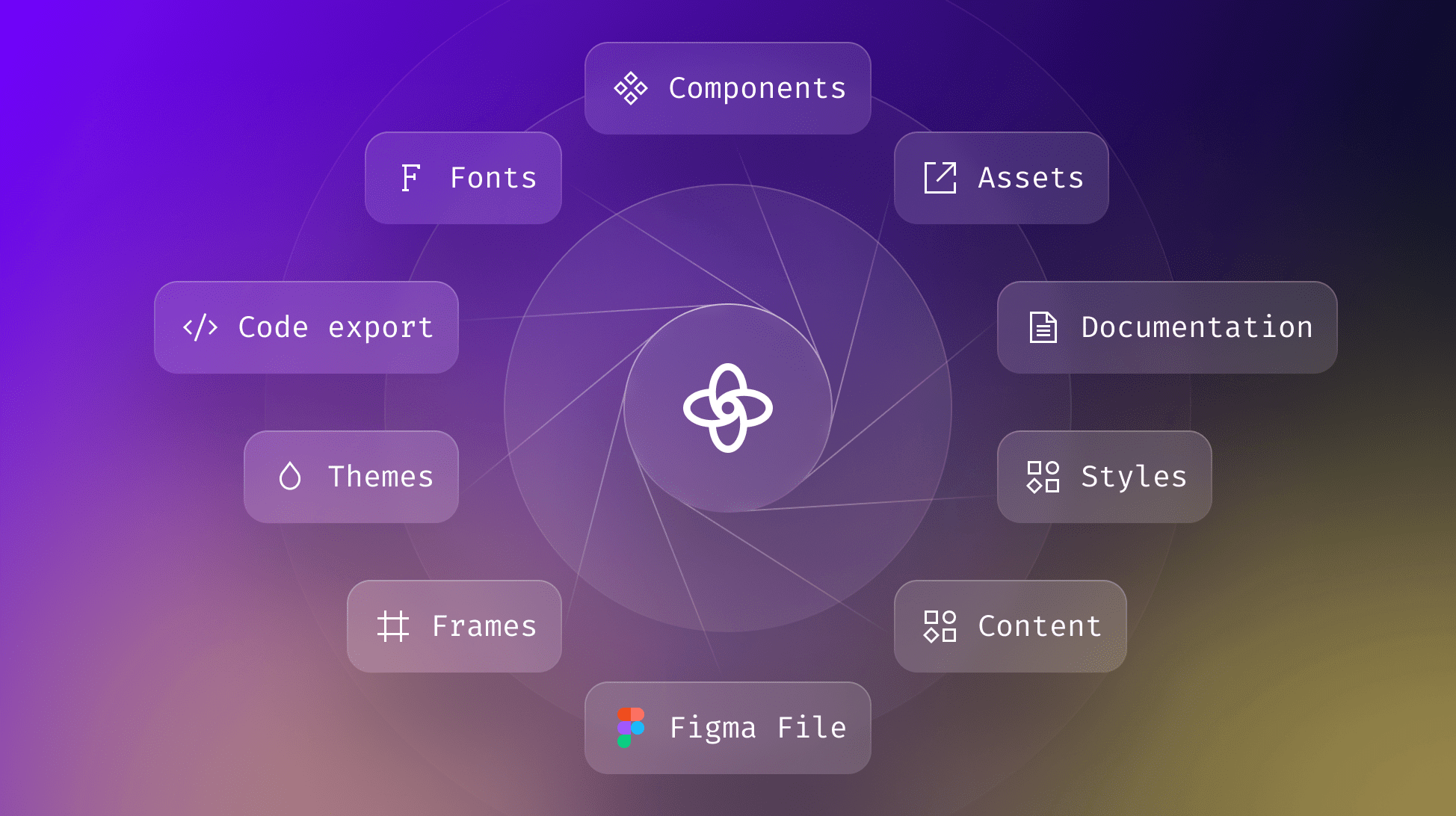
How to Structure Your Design System Using Supernova
Getting started with design system is tough, find out how to structure your design system easily using Supernova.

Getting started with design system is tough, find out how to structure your design system easily using Supernova.
Teams adopt design systems to solve a wide range of pain points, many of which are solved by the structured nature of design systems. This structure will be the framework for how your design, product, developer, marketing, and management team work together. So you might guess that it’s pretty important to get it right. Thankfully Supernova is here to help — in this article, we’ll walk you through how to structure your design system in Supernova.
Before we dive deep, it’s important to highlight that there’s no one-size-fits-all application of design systems. The Atlassian design system that serves 22+ products can’t be structured the same way as a smaller team with one product. We’ll be focused on the best practices for a single-brand design system in this guide.
If your team is at the point where you’re considering building a design system or already have one, then you probably already have all the information you need. The only real requirements you need are to make sure you’re publishing all the content that’s going into your design system in a Figma team library and that all the styles you want to tokenize are applied to layers in these libraries. This makes sure when you automatically import everything to Supernova everything is ready for you to start documenting.
The best way to go about structuring your design system is to take a design-first approach to your information architecture. Basically, how are your Figma files and team libraries structured? Design systems are there to solve your pain points, but most design systems include the following:
By importing your Figma files to Supernova, your UI kit and assets are automatically structured in the Content section. We’ve created a guide to help you easily understand where your Figma elements go in Supernova.
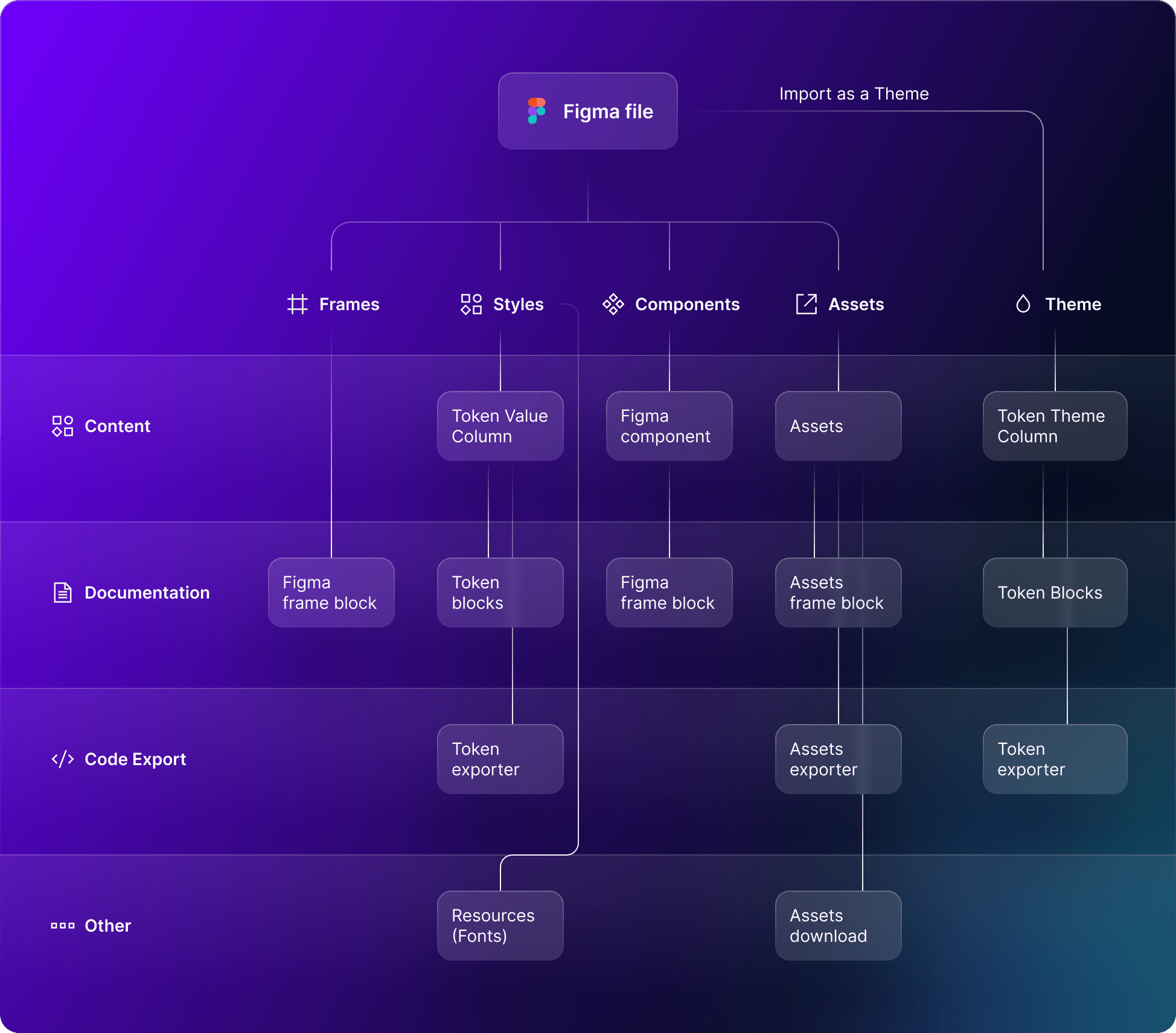
Inside Supernova, you can see how your design system structure comes to life.
From the Tokens tab, you have access to all your Figma Styles. You can start creating your own Tokens and Aliases to reference different values and tokens to better structure your design system.
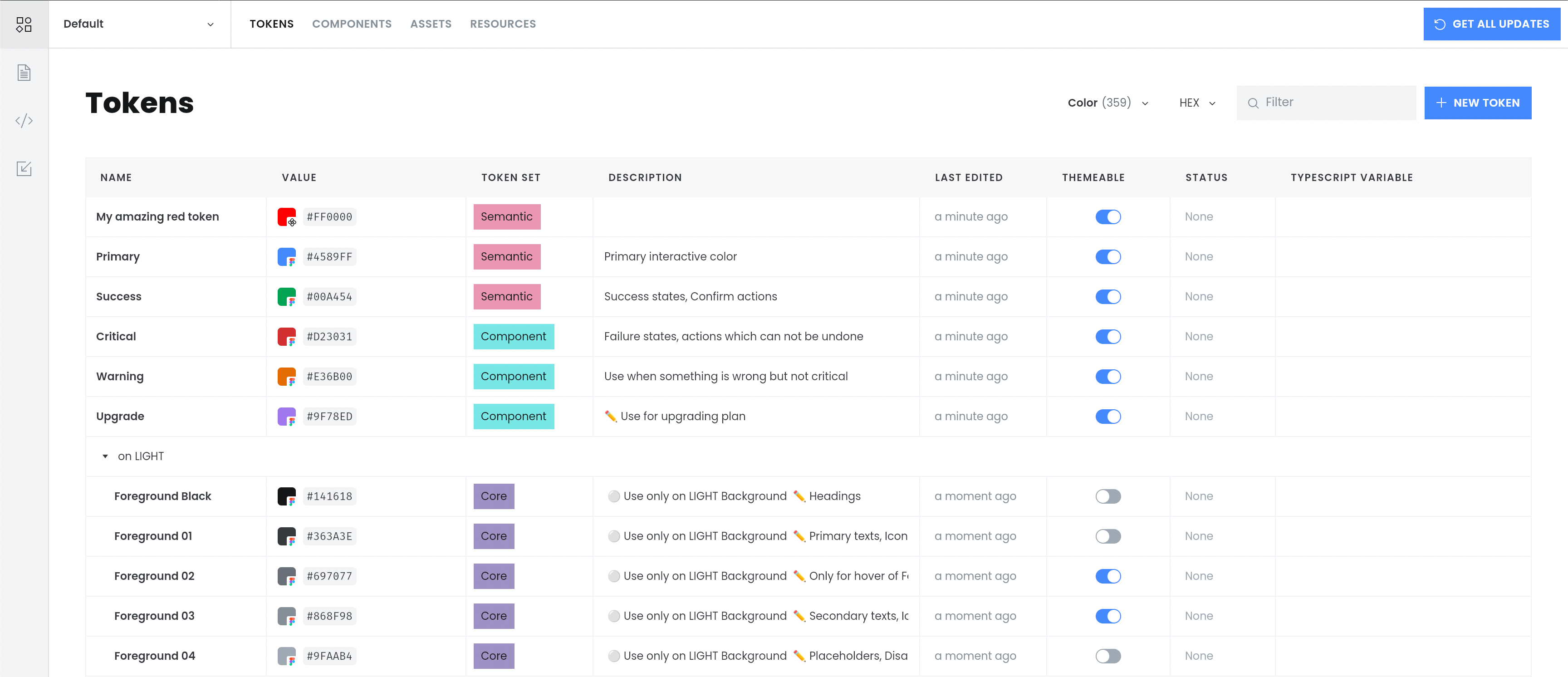
In the case you have multiple themes in your design system, you can easily add theme overrides from the same Tokens view in Supernova.
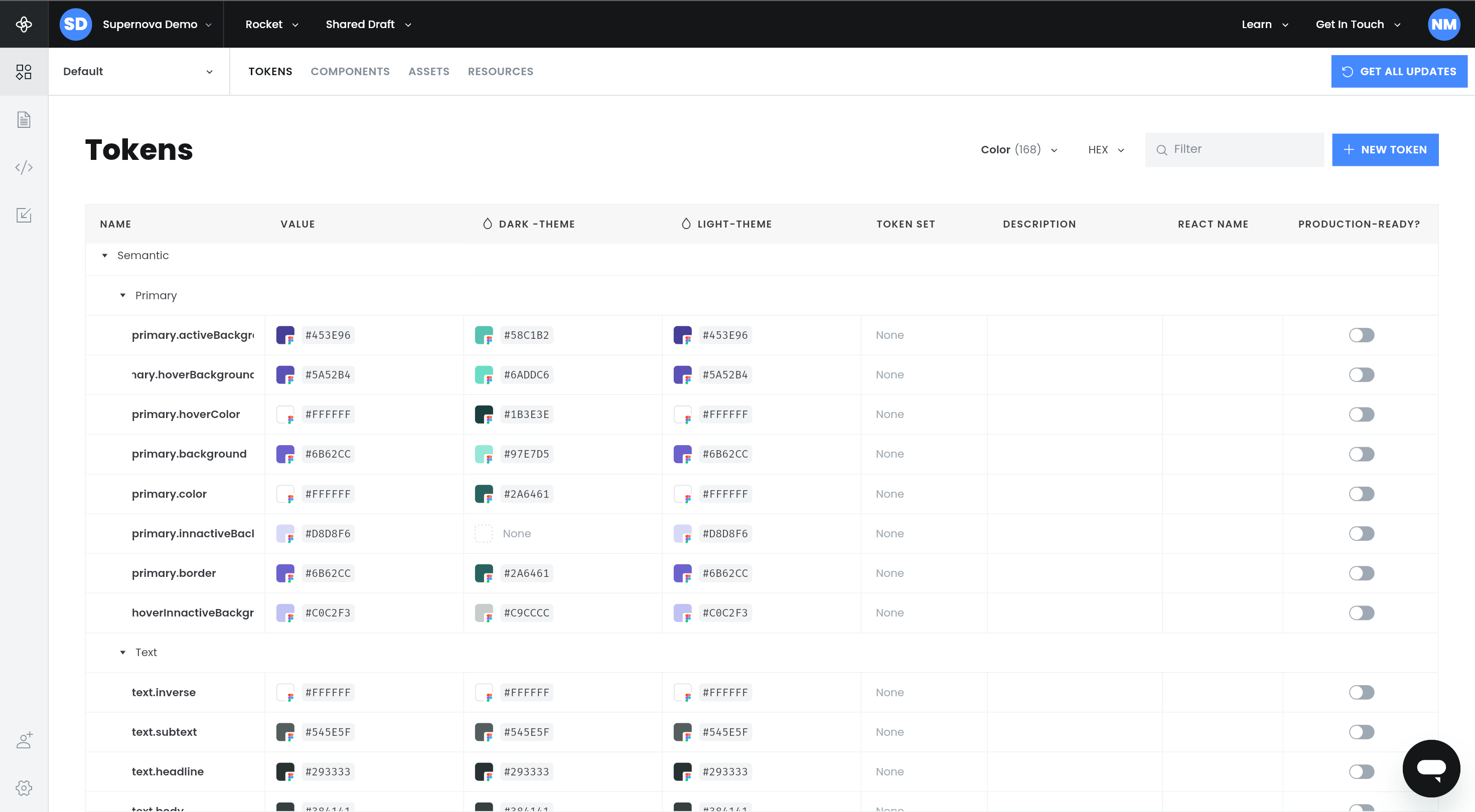
By having all your themes in one view you can better organize and manage your design tokens. You can find more details about themes, including how to create them in our docs.
Similarly, your components are automatically arranged in rows in the Components tab that you can customize to your specific needs.

Finally, your assets will also be arranged in their own content tab. Here you can download them and see how they’re organized.
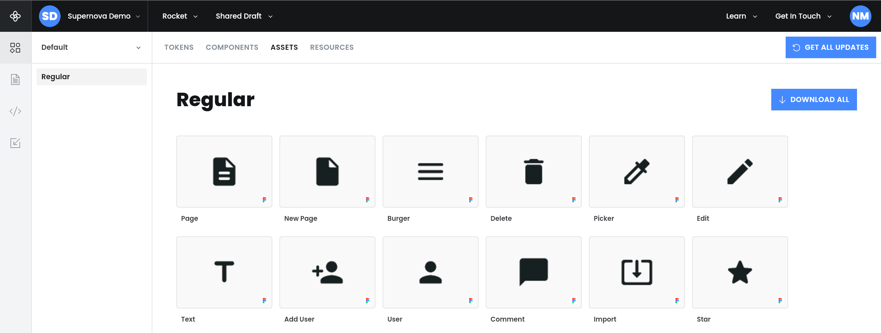
This is all automatically sorted out for you by Supernova, but as we’ve mentioned it would need to apply some structure to your Figma libraries before importing them. Where you can start having a meaningful impact on the structure is with documentation, so let’s take a look.
Documentation for your design system plays the biggest role in increasing adoption. If you want all the nice benefits of having a design system like consistency, efficiency, and scalability, you need your users (your team members in this case) to opt in. With documentation, your goal is to introduce your users to your design system and guide them on how to use it. And similar to any design system, the structure of your documentation will take a different shape depending on your needs. But let's go through the must-haves.
✍️ You can learn how to add sections, subsections, and more in Supernova here.
Going back to the goals of documenting your design system, an introduction is something that is often overlooked but very critical. You should treat design system users as you would end-users. A clean and well-thought-out introduction to your design system will help onboard team members faster and set up your design system for success.
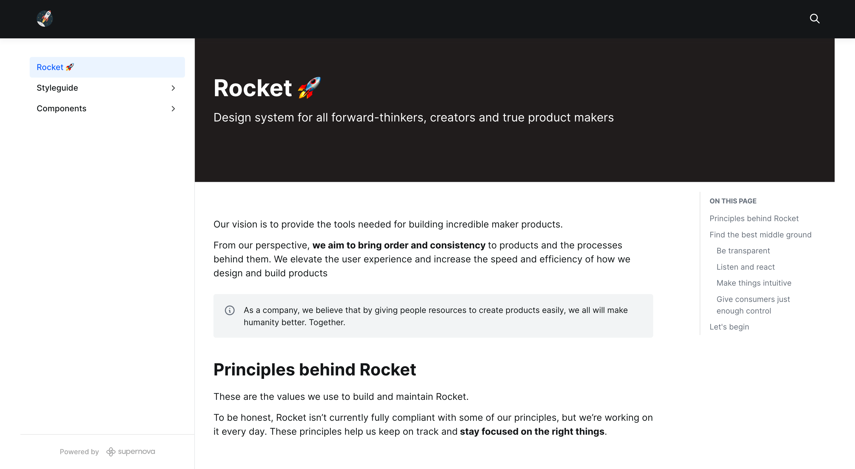
This is a good place to lay out your structure, why the user should be using the design system, and how to understand it better. Voice and tone make a huge difference in all external and internal communication, so it’s also important to bear in mind how you're talking to the design system user.
There’s a ton written on style guides and what they actually are and what they’re used for. Without getting into an internet debate on what it actually means, for the purpose of this article, we’ll be using style guides as the place where you’ll be explaining what your different design tokens and assets are and how to use them correctly.
We recommend you rely on how your design tokens are already structured and go off of that for your style guide structure. Cover all your essential tokens like colors, fonts, spacing, animations, shadows, assets, etc. Keep each type of token in a separate section and cover their use cases. So for example your primary.background color token would go under Background & Foreground Colors in the Colors section of your style guide.
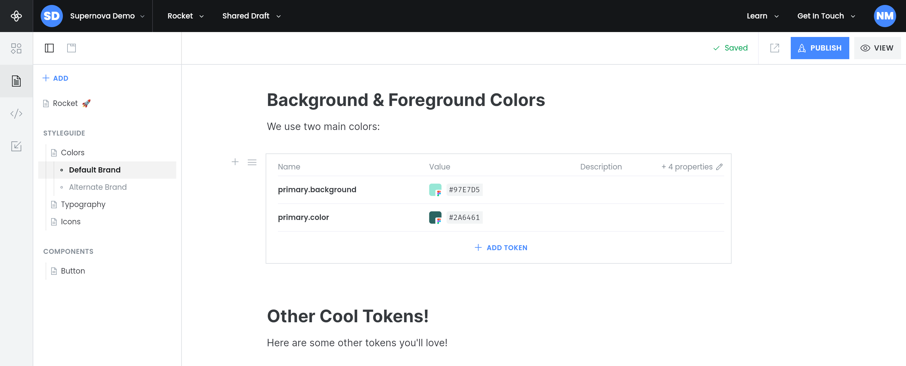
And with Supernova you can display these tokens in a variety of different ways to best convey your tokens how you would want.
Unlike the granular and atomic design tokens, components are more representative of your final product. They need more guidance on how to use them, where they go, and any potential variants.
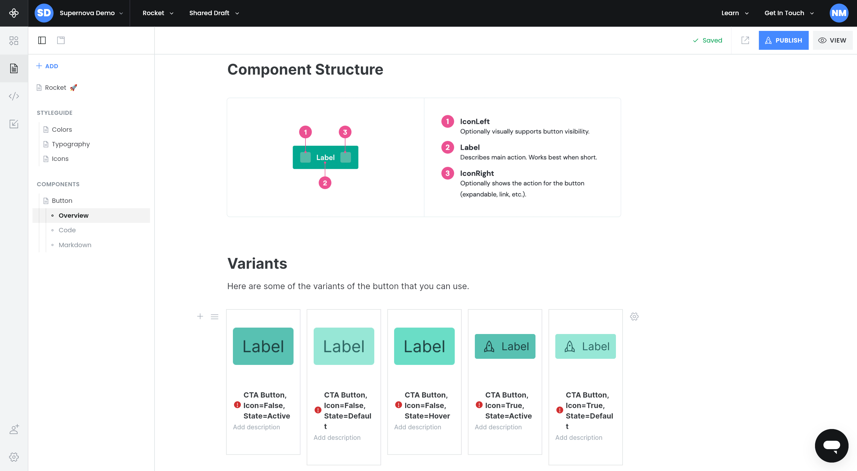
You can also add subsections for component code, their representation in markdown, or any other relevant information.
———————————————————————————————————————
With that, you have the core structure of your design system in place. Remember that each design system is unique to each team, so don’t be afraid to deviate to add whatever you feel would benefit your users. And if you’re working on a design system for multiple brands within the same team, stay tuned for our follow-up article.