Top 10 Government Design Systems: Enhancing Digital Public Services
Discover the top 10 government design systems enhancing digital public services globally, ensuring accessibility, consistency, and efficiency.

Discover the top 10 government design systems enhancing digital public services globally, ensuring accessibility, consistency, and efficiency.
As governments worldwide continue to embrace digital transformation, the importance of cohesive and user-friendly design systems continues to grow. These design systems ensure that government websites and services are accessible, consistent, and efficient. Here, we highlight ten of the best government design systems and key contributors from around the globe, showcasing their unique features and contributions to public service digitalization.
.png)
Created in 2015, the USWDS offers a comprehensive library of components and patterns designed to make U.S. government websites accessible and consistent. With a strong emphasis on user experience and making them mobile friendly, the system is backed by extensive documentation. This design system integrates seamlessly with modern web technologies, ensuring that federal websites can adapt to evolving user needs and technological advancements.
Notable contributor:
Dan Williams: Leading the project, Dan Williams and the rest of the team share insights on best utilizing the USWDS in a recent video walkthrough on their YouTube channel. This resource provides valuable guidance for developers and designers.
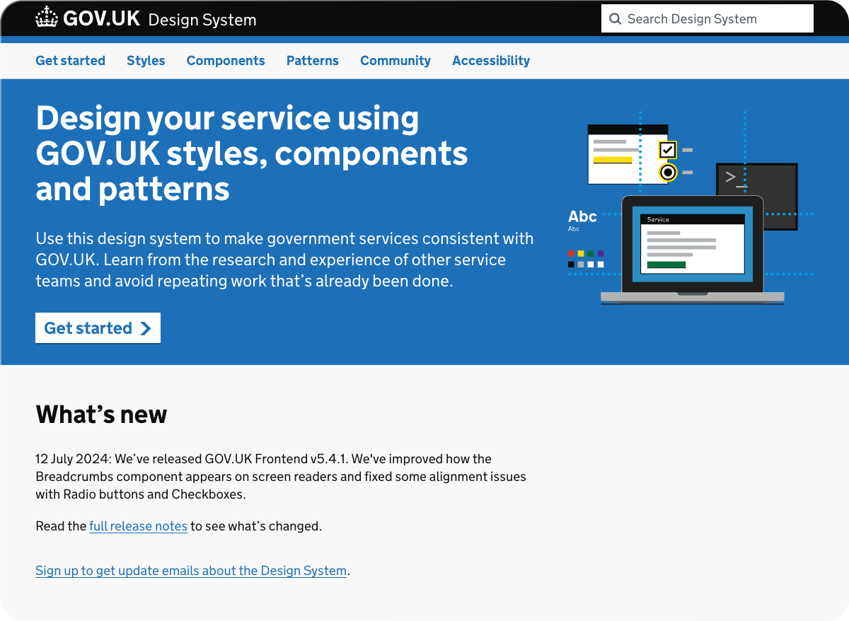
Known for its extensive support, the GOV.UK Design System includes styles, components, and patterns. It ensures that government services are user-friendly and accessible, adhering to WCAG 2.0 standards. The system's design philosophy focuses on putting the user first, making it easier for citizens to find and use the services they need. Its clean, straightforward approach has set a benchmark in digital public service design.
Notable contributor:
Charlotte Downs: An Interaction Designer and one of the leads on the project, Charlotte encourages external contributions to the design system. You can explore their in-depth discussions on how to contribute via their YouTube channel, where Charlotte leads the conversation on the collaborative efforts involved.
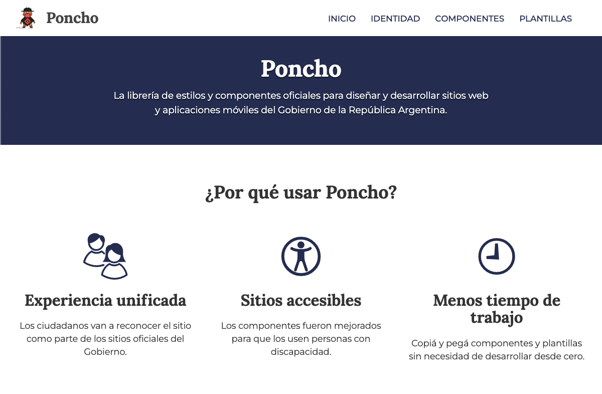
Poncho provides a more guided set of experiences and templates to ensure a consistent design philosophy across the board. It emphasizes simplicity and ease of use, making it a valuable resource for government developers focused on saving time and making them accessible. Poncho’s design philosophy revolves around creating intuitive interfaces that cater to a diverse population, ensuring that digital services are inclusive and easy to navigate.
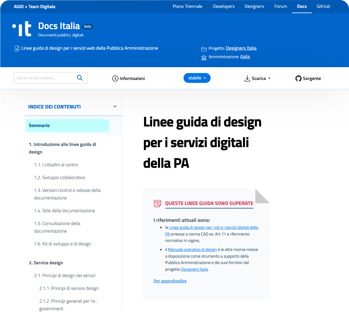
Despite still being in beta, Italy’s design system is extensive, covering usability, accessibility, UI principles, and service design. It offers a wealth of resources, including guides for testing, content design, SEO, and much more. This comprehensive approach ensures that all aspects of digital service design are covered, from initial concept to final implementation. Italy's Agency for Digital Italy (AgID) and the Italian Digital Transformation Team (Team Digitale) sponsored the combined effort to create the country's design system as part of a broader government effort to digitize.
Notable contributor:
Daniele Tabellini: One of the caretakers of the .italia Design System, Daniele focuses on usability, accessibility, and open design. You can read his blog post about the inception and evolution of the government design system, detailing how it became what it is today.

The GOLD Design System, formerly known as the Australian Government Design System, provides a framework and set of tools to help designers and developers create government products and services with ease. It focuses on high usability and accessibility standards, ensuring a consistent user experience across all government platforms. Key features include responsive design, accessibility compliance (WCAG 2.1 AA), and a modular, customizable approach supported by an open community of developers, designers, and accessibility experts. The system is designed to be flexible and continuously improved, offering robust browser support and options for various JavaScript frameworks.

Another project still in beta, Scotland’s design standards focus on a wider set of general service guidelines rather than focused design elements. The guidelines help ensure that all Scottish government websites provide a consistent and efficient user experience. By prioritizing usability, Scotland's design standards aim to create and promote digital services in a consistent manner.
Notable contributor:
Jonathan Sutcliffe: As the front-end engineering lead with over 10 years of experience on Scottish government projects, Jonathan is passionate about usability and accessibility. He ensures all digital services from the Scottish government have the necessary tools to achieve these goals.
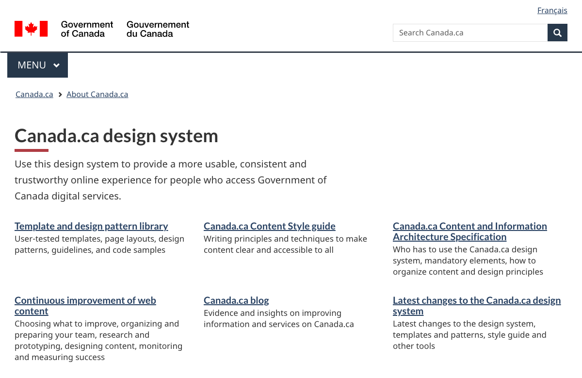
Canada’s design system offers a robust design system, but prioritizes a more templated approach. It aims to create cohesive and accessible digital services for Canadian citizens. By providing clear and detailed guidelines and templates, the design system helps ensure that Canadian government websites are both visually appealing and functionally effective. You can find the latest updates and useful best practices on their blog.
Notable contributor:
Aaron Snow: As the CEO of the Canadian Digital Service, Aaron Snow played a key role in the development and implementation of the design system before stepping down. In his blog post, he shares insights into the inception and evolution of the system, highlighting its impact on Canadian digital services and the importance of usability and accessibility in government projects.
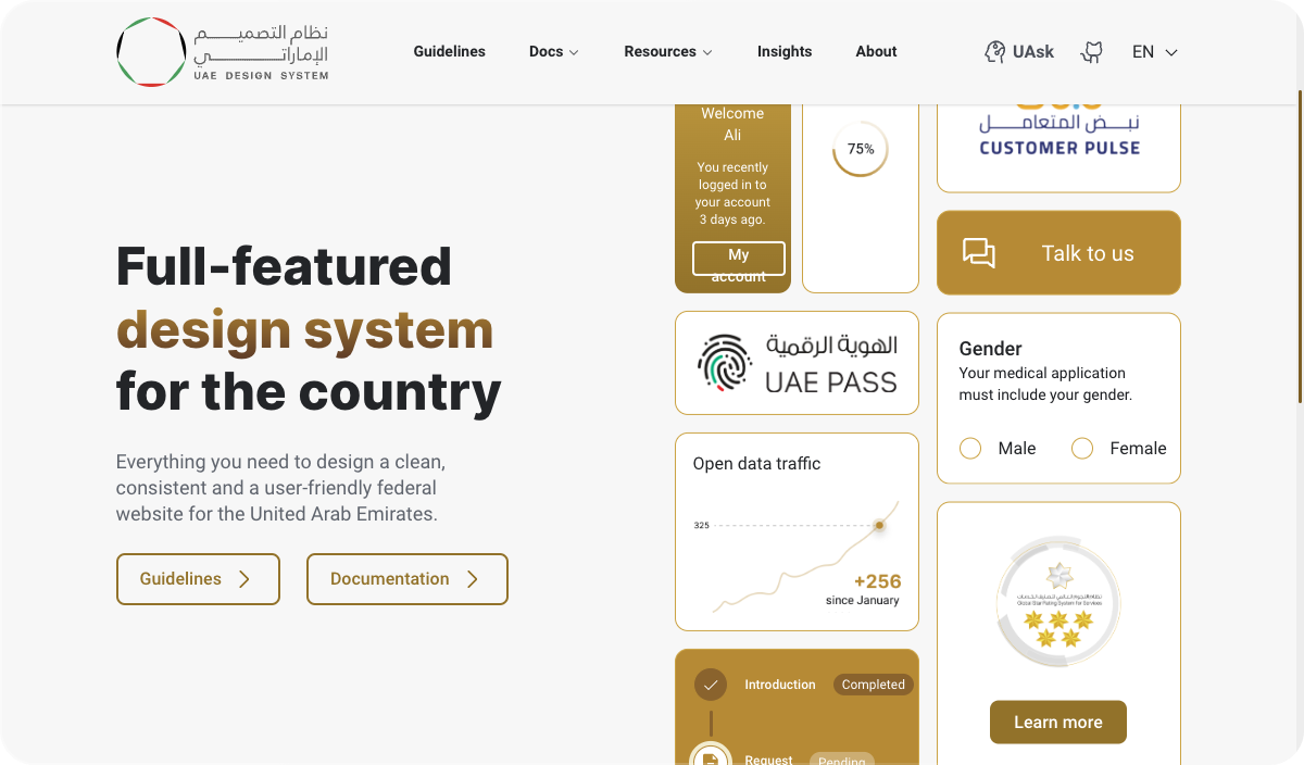
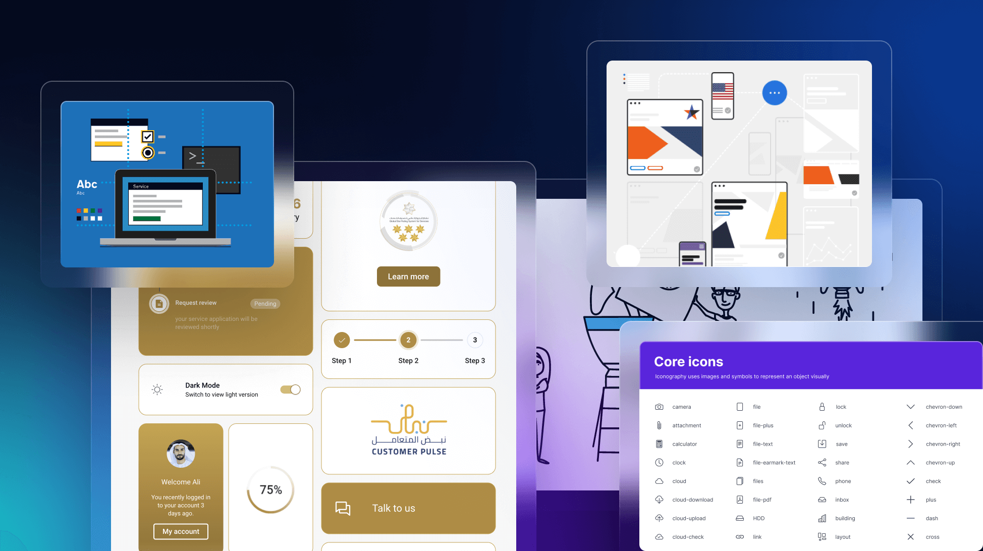
One of the best newer design systems comes from the UAE. You can instantly tell from the homepage, that it sets themselves apart from other governmental design systems with more modern components and elements. The documentation, guidelines, and resources are all extensive, covering all the needs to create governmental websites and apps. It focuses on user experience and integrates modern design principles. By embracing cutting-edge design practices, the UAE Government Design System aims to set a new standard for digital public services in the world.
Notable contributions:
The UAE Government Design System is a unique collaboration between the Telecommunications and Digital Government Regulatory Authority (TDRA) and the marketing agency Conceptualize. Manal Al Afad led the government side, while Moiz Sitabkhan, CEO of Conceptualize, spearheaded the agency's efforts. Together, they launched version 2.0 of the design system.
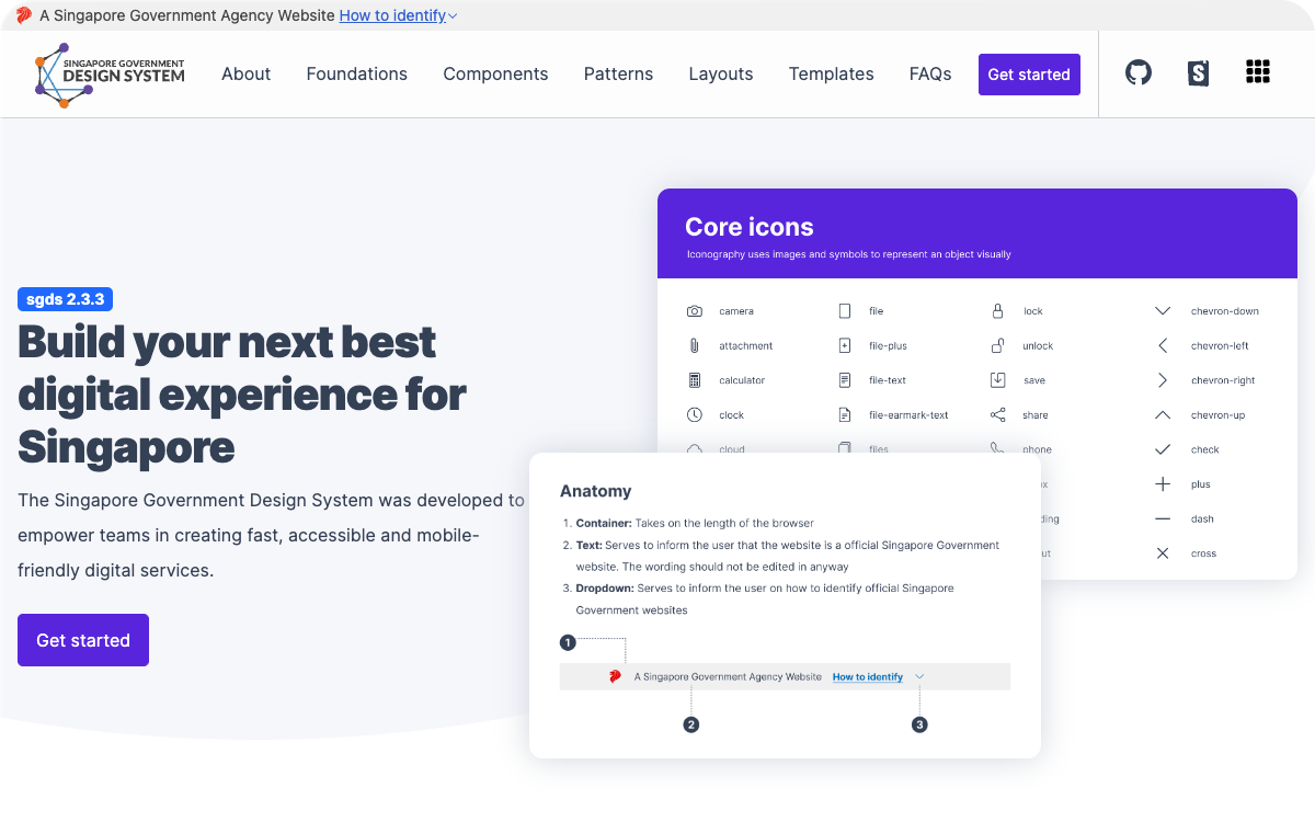
Another modern design system comes from Singapore. SGDS aims to empower agencies to create fast, accessible, and mobile-friendly digital services with a common set of UI components, patterns, and templates. Compliant with the Digital Service Standards (DSS), SGDS includes customizable components, templates, and a theme customizer with a built-in color contrast checker. It facilitates greater scalability, trust, and user experience, making maintenance easy and cost-effective. SGDS supports static, dynamic, and transactional websites, with various existing success stories.
Notable contributor:
Rachel Tan: As a designer for the Singapore Government, Rachel emphasizes that designing for public good doesn't have to be bureaucratic or slow. She highlights their experimental approach to problem-solving, rapid hypothesis testing, and product launches that positively impact Singapore's 5.5 million residents. Through initiatives like annual hackathons and a strong design system, Rachel and her team foster a culture of collaboration and experimentation. This approach was detailed in their talk at Figma Config, available here.
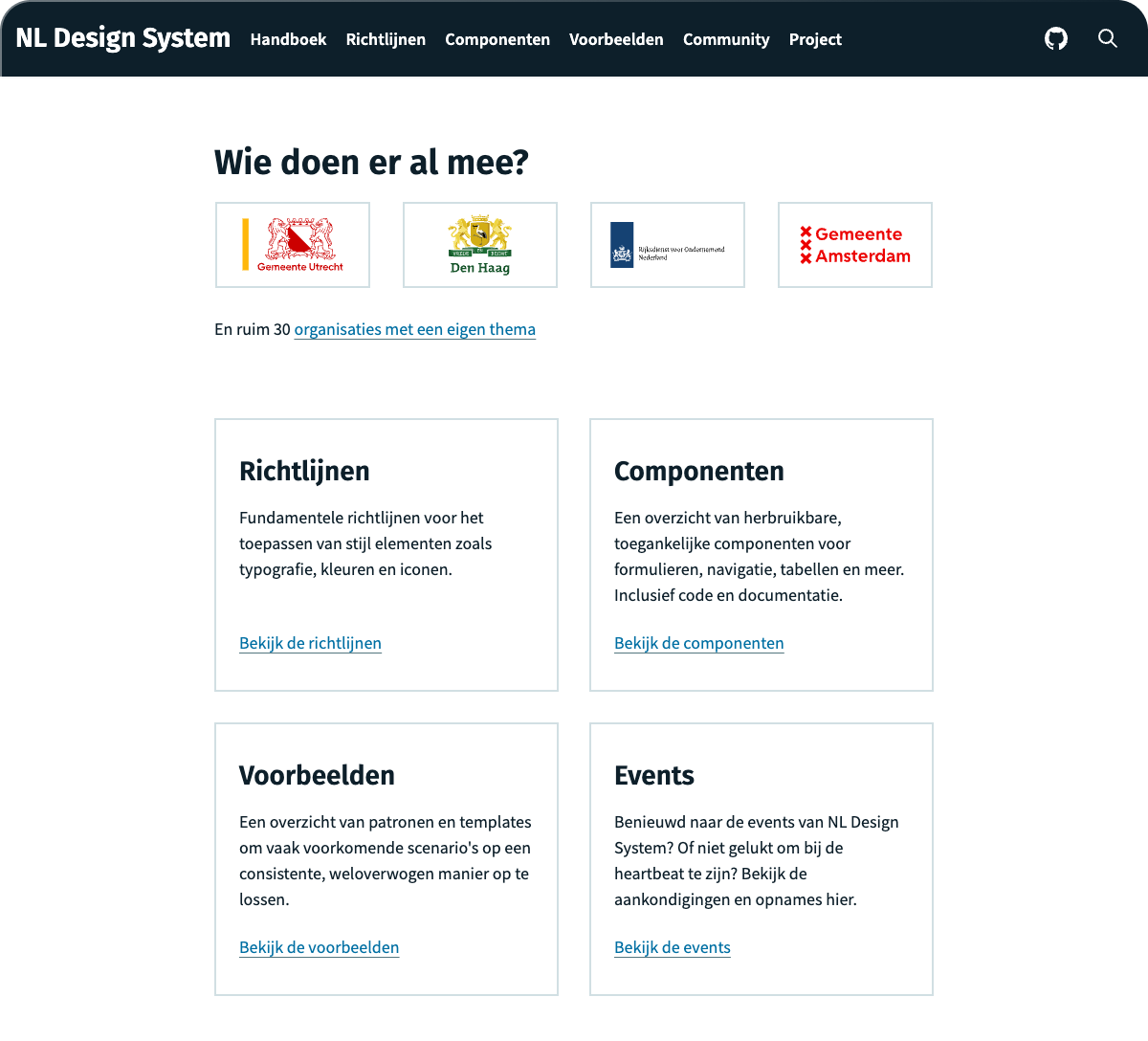
The NLDS is built and maintained through a strong community-first approach. Contributors are welcomed and have actively helped make it what it is today. The project offers a variety of UI components and guidelines to create cohesive and user-friendly digital services in the local dutch language. It emphasizes accessibility and consistency, helping to streamline the development process. By providing a robust set of tools and guidelines, both the community and government teams have a say in the future of their websites and web apps.
Notable contributor:
Robbert Broersma: One of the initial contributors, Robbert shared his insights on the community-driven approach in a talk, highlighting the project's collaborative nature and open-source principles. Watch the talk here. Key features include adaptable components, design tokens for customization, and integration with various frameworks.
These design systems exemplify the best practices in digital public service design. By leveraging these design systems, governments can continue to improve their digital presence, making it easier for citizens to access and interact with public services. Through continuous iteration and feedback, these systems evolve, adapting to new technologies and user expectations. Embracing a design system approach not only improves the quality of digital public services but also fosters trust and satisfaction among citizens.
If you are looking for more inspiration, check out these additional examples alongside the U.S. Web Design System.