Why UI Libraries Aren’t Enough: Solving Enterprise Design System Bottlenecks
- Authors

- Name and Role
- Nezar MansourContent Writer
UI libraries are often seen as a quick solution to streamline design and development, but for enterprises, they rarely scale effectively. Without governance, accessibility, and collaboration baked in, UI libraries can become bottlenecks rather than enablers. Let’s explore why enterprises outgrow UI libraries, the challenges they face, and how transitioning to a holistic design system can unlock efficiency and scalability.
What Do We Mean by "UI Libraries"?
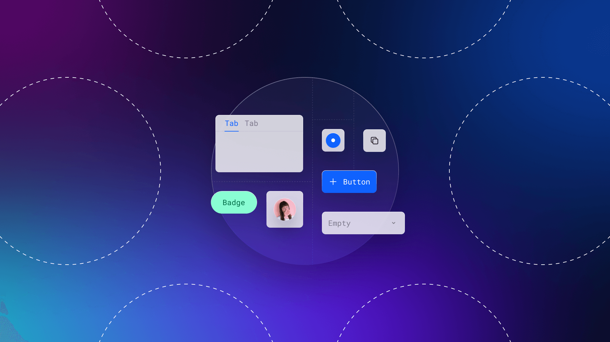
UI libraries are curated sets of reusable components (buttons, forms, icons) that accelerate development. Teams typically adopt them in two ways:
- Third-Party Libraries: Prebuilt solutions like Material UI or Chakra UI offer ready-made components aligned with design philosophies like Google’s Material Design. These prioritize speed but limit customization.
- In-House Libraries: Custom component collections built to reflect brand-specific needs. While more flexible, they often lack the governance of full design systems.
Why Teams Start with UI Libraries
Enterprises often gravitate toward UI libraries for pragmatic reasons:
- Speed: Prebuilt components let teams ship MVPs faster—critical for startups or departments under tight deadlines.
- Cost: Building a design system requires upfront investment in planning, documentation, and cross-team alignment.
- Perceived Simplicity: Smaller teams assume component libraries alone ensure consistency, underestimating the complexity of scaling.
However, these short-term gains mask long-term costs.
The hidden costs of UI library-only approaches
The consistency mirage
UI libraries often lead to fragmented implementation without governance. Without clear alignment, brand cohesion suffers, and teams waste time reinventing components instead of building new features. As Cintia Romero, Design Systems Lead at Pinterest, explains: “Education and adoption is a chain of events, but everything starts with education.” Learn more about fostering alignment through workshops.
Accessibility debt
Many UI libraries lack production-ready accessibility features like ARIA roles or keyboard navigation. Retrofitting accessibility into existing components delays product launches and increases legal risks for enterprises. A 2024 retrospective on design systems and accessibility highlights how embedding WCAG-compliant accessibility from the start is critical for scaling design systems effectively.
Collaboration chaos
Teams lose valuable time reconciling mismatched components across tools like Figma and Jira. This inefficiency fosters unofficial libraries — unapproved, team-specific component sets that undermine the system's purpose.
5 signs that you've outgrown your UI library
If you're still unsure about whether you're starting to hit these growing pains, these tell-tale signs should help make it clear:
- Teams maintain unofficial libraries outside the approved system.
- Legal teams request frequent accessibility audits due to compliance gaps.
- New hires take weeks to understand how to use components effectively.
- Product teams spend more time reconciling designs than shipping features.
- Multiple “approved” versions of the same component exist across platforms.
Anatomy of an enterprise-grade design system
The 4 operational pillars
- Centralized governance: Version-controlled components with clear maturity tiers (Experimental → Stable) ensure consistency at scale.
- Embedded accessibility: WCAG-compliant markup baked into component APIs eliminates reactive fixes.
- Living documentation: Documenting patterns, components, accessibility, and more helps teams reliably and consistently design and build products while reducing onboarding time.
- Bi-directional consistency: Design tokens that flow seamlessly between design tools like Figma and development environments streamline workflows (source).
Breaking the bottleneck with a design system in three phases
Phase 1: Audit & align
- Map component sprawl (e.g., redundant button variants).
- Run cross-role workshops to align on priorities and pain points.
Phase 2: Build with purpose
- Start atomic: Define foundational tokens (color, typography) before scaling up to components and templates.
- Implement contribution workflows inspired by GitHub’s model for collaboration.
Phase 3: Grow adoption
- Use analytics to track component usage and identify gaps in adoption.
- Gamify adoption by recognizing “System Champions” in team meetings.
Scaling your design system
Design systems are evolving beyond static libraries into dynamic ecosystems powered by automation and analytics. Future features like AI-generated documentation and predictive alerts could enable teams to stay ahead of scaling challenges. By embedding accessibility, governance, and collaboration into every stage of the workflow, enterprises can future-proof their systems while delivering consistent user experiences.
From liability to leverage
UI libraries focus on what’s built; design systems optimize how teams build. By treating your system as a collaborative workflow rather than a static catalog of components, you can unlock measurable benefits such as:
- Faster feature delivery through reusable patterns
- Significant reduction in accessibility rework, saving time and resources
- Cross-functional alignment that bridges design, development, and product teams